XARA
DESIGNER
PRO X10
First Look
By Gary W. Priester

New Website Features
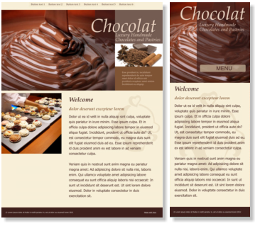
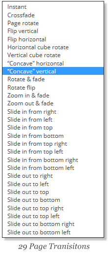
RESPONSIVE WEBSITES!!! We’ve all been asking for Responsive Websites. Heck, we’ve been demanding Responsive Websites! Well, the big news is Designer Pro X10 can create responsive websites and still remain completely drag and drop, WYSIWYG easy! And Designer Pro X10 gives you the ability to design the right size site for the right size browser or device. Most responsive websites rearrange the text and graphics to fit the screen size with often unattractive results. What looks good full screen on your computer might not look so great on a tablet or smart phone when the text and graphics are reshuffled. Xara Designer Pro X10 takes a different approach to responsive websites. Instead of a reshuffle the content approach, Designer Pro X10 lets you design “Variants” of your website for specific display sizes, from full desktop browsers to mobile devices. These variants, which are actually different layouts of the same site are linked, so if you change the text or photos on the main site, the text and/or photos on the variant or variants changes as well. The browser automatically loads the right variant. If you reduce the width of your browser, you’ll see the mobile site. Go ahead, try it. This review uses another new feature called Supersites, which can be used to create one continuous site that you can scroll up or down (or side to side). In the mobile version, you can swipe up or down (or side to side). Or you can use page transitions (29 transitions) as I have done with this review. More on Transitions in a moment. Automatic Redirect Many of us have struggled with adding redirect scripts to our websites to send the visitor to a mobile site. This required us to create two separate websites published to two different folders. No big deal, but extra work. Now, when you publish your website and Variant (or Variants), Designer Pro X10 publishes everything to the same folder. A CSS Media Query automatically ensures the right Variant displays in the right screen size. If you are not a designer, or you do not have the time to create your own site from scratch, there are handsome, professionally designed complete website templates that come with a Variant site. Look for the (R) designation after the Website Template name. The example above shows one of these yummy Websites Templates. For more information on Variants click here.
Xara Designer Pro X10 — First Look - Page 2
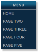
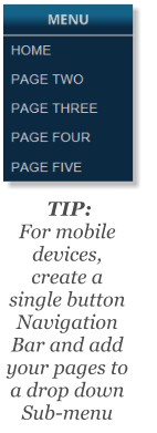
TIP:
For mobile
devices,
create a
single button
Navigation
Bar and add
your pages to
a drop down
Sub-menu


FIRST PAGE


New Website Features
RESPONSIVE WEBSITES!!! We’ve all been asking for Responsive Websites. Heck, we’ve been demanding Responsive Websites! Well, the big news is Designer Pro X10 can create responsive websites and still remain completely drag and drop, WYSIWYG easy! And Designer Pro X10 gives you the ability to design the right size site for the right size browser or device. Most responsive websites rearrange the text and graphics to fit the screen size with often unattractive results. What looks good full screen on your computer might not look so great on a tablet or smart phone when the text and graphics are reshuffled. Xara Designer Pro X10 takes a different approach to responsive websites. Instead of a reshuffle the content approach, Designer Pro X10 lets you design “Variants” of your website for specific display sizes, from full desktop browsers to mobile devices. These variants, which are actually different layouts of the same site are linked, so if you change the text or photos on the main site, the text and/or photos on the variant or variants changes as well. The browser automatically loads the right variant. If you reduce the width of your browser, you’ll see the mobile site. Go ahead, try it. This review uses another new feature called Supersites, which can be used to create one continuous site that you can scroll up or down (or side to side). In the mobile version, you can swipe up or down (or side to side). Or you can use page transitions (29 transitions) as I have done with this review. More on Transitions in a moment. Automatic Redirect Many of us have struggled with adding redirect scripts to our websites to send the visitor to a mobile site. This required us to create two separate websites published to two different folders. No big deal, but extra work. Now, when you publish your website and Variant (or Variants), Designer Pro X10 publishes everything to the same folder. A CSS Media Query automatically ensures the right Variant displays in the right screen size. If you are not a designer, or you do not have the time to create your own site from scratch, there are handsome, professionally designed complete website templates that come with a Variant site. Look for the (R) designation after the Website Template name. The example above shows one of these yummy Websites Templates. For more information on Variants click here.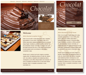
XARA
DESIGNER
PRO X10
First Look
By Gary W. Priester

Xara Designer Pro X10 — First Look - Page 2


FIRST PAGE