FIRST LOOK By Gary W. Priester

XARA
WEB DESIGNER 10
PREMIUM

We’ve all been asking for Responsive Websites. Heck, we’ve been demanding Responsive
Websites! Well, the big news is Web Designer 10 Premium can create responsive websites
and still remain completely drag and drop, WYSIWYG easy! And Web Designer Premium 10
gives you the ability to design the right size site for the right size browser or device.
Most responsive websites rearrange the text and graphics to fit the screen size with often
unattractive results. What looks good full screen on your computer might not look so great
on a tablet or smart phone when the text and graphics are reshuffled. Xara Web Designer 10
Premium takes a different approach to responsive websites. Instead of a reshuffle the
content approach, Web Designer 10 Premium lets you design Variants of your website for
specific display sizes, from full desktop browsers to mobile devices. These variants, which
are actually different layouts of the same site are linked, so if you change the text or photos
on the main site, the text and/or photos on the variant or variants changes as well. The
browser automatically loads the right variant. If you reduce the width of your browser, you’ll
see the mobile site. Go ahead, try it.
For my First Look, I will focus on Web Designer 10 Premium, but at the end of the review
you’ll find a link to a comparison chart of features so you can decide which version (Web
Designer 10 Premium or Web Designer 10 Classic) is just right for you.
This website uses another new feature called Supersites, which creates one continuous site
that you can scroll up or down (or side to side). In the mobile version, you can swipe up or
down (or side to side). This site scrolls vertically. Scroll or swipe down to the next page.
RESPONSIVE
WEBSITES!


SCROLL
TO THE NEXT
PAGE


XARA
WEB
DESIGNER 10
PREMIUM

We’ve all been asking for Responsive
Websites. Heck, we’ve been demanding
Responsive Websites! Well, the big news is
Web Designer 10 Premium can create
responsive websites and still remain
completely drag and drop, WYSIWYG easy!
And the way Xara does it gives you a lot of
leeway.
Most responsive websites rearrange the
text and graphics to fit the screen size with
often unattractive results. What looks good
full screen on your computer might not
look so great on a tablet or smart phone
when the text and graphics are reshuffled.
Xara Web Designer 10 Premium takes a
different approach to responsive websites.
Instead of a reshuffle the content approach,
Web Designer 10 Premium lets you design
Variants of your website for specific display
sizes, from full desktop browsers to mobile
devices. These variants, which are actually
different layouts of the same site are linked,
so if you change the text or photos on the
main site, the text and/or photos on the
variant or variants changes as well. The
browser automatically loads the right
variant. I’ll explain all this in a bit. But it’s
such exciting news I just couldn’t hold back!
For my First Look, I will focus on Web
Designer 10 Premium, but at the end of the
review you’ll find a link to a comparison
chart of features so you can decide which
version (Web Designer 10 Premium or
Classic) is just right for you.
This website uses another new feature
called Supersites which creates one
continuous site that you can scroll up or
down through. In the mobile version, you
can swipe up or down. Let’s look at
Responsive Websites and Supersites. Scroll
or swipe down to the next page.
RESPONSIVE
WEBSITES!

FIRST LOOK
By Gary W. Priester
TIP:
Mobile devices, have less bandwidth and smaller
screens. Simplify your content. Don’t just scale
down your large website. Design your site
specifically for a smaller screen.

Responsive Websites Web Designer 10 Premium can create Scale to Fit
Screen Supersites and presentations. These automatically scale to fit any
screen size. However, Scale to Fit Screen websites work best in a square
format. But most websites are deeper than they are wide. For these sites
the best solution is Responsive Websites, variations of the same website
that are designed for a specific screen size. Here’s how Web Designer 10
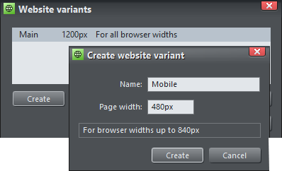
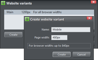
Premium creates responsive websites. It’s called Website Variants.
First you create your main website, or use an existing site. Then you use
the new Website Variants menu to create a smaller version or Variant. Web Designer
10 creates a version with smaller pages based on the Variant Page Width (in this case
480px, perfect for mobile devices), and places all the content from your main website on the variant
layout. The full size content needs to be scaled down to fit on the smaller page size, so you resize the
content to work best in the smaller size. Mobile sites should not simply be smaller versions of the large
website, they should be simplified and pared down to the essential elements. What looks good on a
large page can look horribly cluttered on a smart phone. If you edit or modify the text or photos on
one site, these items automatically update on the Variant site. This is called Live Share.
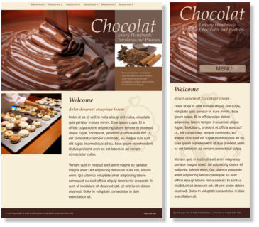
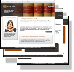
The page examples on the left show two different websites Variants,
normal browser and mobile. You can quickly create a desktop browser
site and a mobile site. You can create a tablet or specific device Variant.
Even separate Variants for portrait and landscape. It’s all up to you.
Automatic Redirect Many of us have struggled with adding redirect
scripts to our websites to send the visitor to a mobile site. This required
us to create two separate websites published to two different folders.
Not an huge problem, but extra work. Now, when you publish your
website and Variant (or Variants), Web Designer 10 Premium publishes
everything to the same folder. A CSS Media Query automatically
ensures the right Variant displays in the right screen size.
If you are not a designer, or you do not have the time to create your
own site from scratch, there are handsome, professionally designed
complete website templates that come with a Variant site. Look for the (R) designation after the
Website Template name. The example above shows one of these yummy Websites Templates.
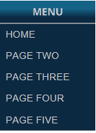
TIP
For mobile
devices, create
a single button
Nav Bar and add
your pages to a
drop down
Sub-menu

SCROLL
TO THE NEXT
PAGE
FIRST LOOK By Gary W. Priester
XARA
WEB DESIGNER 10
PREMIUM
A full browser site (left) and
a mobile variant (Right)
FIRST LOOK
By Gary W. Priester
XARA
WEB
DESIGNER 10
PREMIUM
Responsive Websites Web Designer 10
Premium can create Scale to Fit Screen Supersites
and presentations. These site and presentations
automatically scale to fit any screen size. Scale to
Fit Screen websites work best in a square format.
But most websites are deeper than they are
wide. For these sites the best solution is
Responsive Websites, sites that are designed for a
specific screen size. Here’s how Web Designer 10
Premium creates responsive websites. It’s a
process called Website Variants.
First you create your main website, or use an
existing site. Then you use the new Website
Variants menu to create a smaller version or
Variant. Web Designer 10 creates a version with
smaller pages based on the Variant Page Width
(in this case 480px, perfect for mobile devices),
and places all the content from your main
website on the variant layout. The full size
content needs to be scaled down to fit on the
smaller page size, so you resize the content to
work best in the smaller size. Mobile sites
should not simply be smaller versions of the
large website, they should be
simplified and pared down to
the essential elements. What
looks good on a large page can
look horribly cluttered on a
smart phone. If you edit or
modify the text or photos on
one site, these items automa-
tically update on the Variant
site. This is called Live Share.
The page examples on the left
show two different websites
Variants, normal browser and
mobile. You can quickly create a
desktop browser site and a
mobile site. You can create a tablet or specific
device Variant. Even separate Variants for
portrait and landscape. It’s all up to you.
Automatic Redirect Many of us have struggled
with adding redirect scripts to our websites to
send the visitor to a mobile site. This required us
to create two separate websites published to
two different folders. Not an huge problem, but
extra work. Now, when you publish your website
and Variant (or Variants), Web Designer 10
Premium publishes everything to the same
folder. A CSS Media Query automatically
ensures the right Variant displays in the right
screen size.
If you are not a designer, or you do not have the
time to create your own site from scratch, there
are handsome, professionally designed
complete website templates that come with a
Variant site. Look for the (R) designation after
the Website Template name. The example above
shows one of these yummy Websites Templates.
TIP
For mobile
devices, create
a single button
Nav Bar and add
your pages to a
drop down
Sub-menu
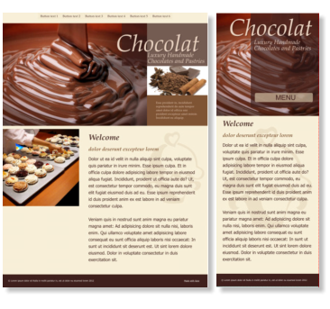
A full browser site (left) and
a mobile variant (Right)

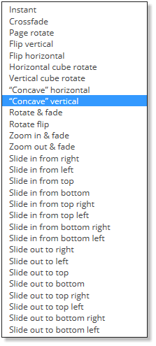
New Page Transitions There are 7 new page transitions that work great with both Websites and
Presentations. You can use the same transition for the entire site, or use a different
transition for each page. I counsel restraint, but I tend towards the conservative. Just
because there are a whole bunch of page transitions does not mean you have to use each
and every one. But they are cool and it is a temptation.
Supersites A brilliant new option in Web Designer 10 Premium is called Supersites.
Supersites are essentially one page websites that scroll horizontally or vertically. There are
three kinds of Supersites as you can see below, Vertical, which scrolls up and down,
Horizontal, which scrolls left and right, and Page Transitions that don’t scroll but use any of
the page transition effects. The Scale to Fit Page option only works with Supersites and
Supersite Presentations.
Supersites work great with tablets
and mobile devices and can be
navigated by swiping the page. And
as I noted these sites can also be
navigated with a scroll mouse. The
page transitions are hardware
accelerated, which is supported in
most current browsers.
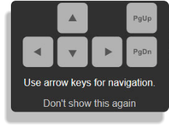
Presentations Update Website Presentations
(I like to call these XaraPoint Presentations), are
a great way to share information with
colleagues and prospective customers. You
can create self-guided presentations, or ones
that you manage remotely for invited guests
only. This is not new but just worth reminding you about. Two new empty page templates let you
design in HD ratio 16:10 and in the more traditional 4:3. When you display
a Supersite Presentation, a pop up appears to remind your visitor that
she or he can use the Page Up and Page Down keys as well as the arrow
keys to navigate through the pages of your presentation.

SCROLL
TO THE NEXT
PAGE
Page Transion Options
FIRST LOOK By Gary W. Priester
XARA
WEB DESIGNER 10
PREMIUM
FIRST LOOK
By Gary W. Priester
XARA
WEB
DESIGNER 10
PREMIUM
New Page Transitions There are 7 new page
transitions that work great with both Websites
and Presentations. You can use the same
transition for the entire site, or use a different
transition for each page. I counsel restraint, but I
tend towards the conservative. Just because
there are a whole bunch of page transitions
does not mean you have to use each and every
one. But they are cool and it is a temptation.
Supersites A brilliant new option in Web
Designer 10 Premium is called Supersites.
Supersites are essentially one page websites
that scroll horizontally or vertically. There are
three kinds of Supersites as you can see below,
Vertical, which scrolls up and down, Horizontal,
which scrolls left and right, and Page Transitions
that don’t scroll but use any of the page
transition effects. The Scale to Fit Page option
only works with Supersites and Supersite
Presentations.
Supersites work great with tablets and mobile
devices and can be navigated by swiping the
page. And as I noted these sites can also be
navigated with a scroll mouse. The page
transitions are hardware accelerated, which is
supported in most current browsers.
Presentations Update Website Presentations (I
like to call these XaraPoint Presentations), are a
great way to share information with colleagues
and prospective customers. You
can create self-guided presentations, or ones
that you manage remotely for invited guests
only. This is not new but just worth reminding
you about. Two new empty page templates let
you design in HD ratio 16:10 and in the more
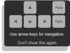
traditional 4:3. When you display a Supersite
Presentation, a pop up appears to remind your
visitor that she or he can use the Page Up and
Page Down keys as well as the arrow keys to
navigate through the pages of your
presentation.
Free Web Hosting Package! Owners of Web Designer 10 Premium get one FREE year of M website
hosting with Magix Online World. This includes 2 GB of server space, a free domain name, and a free
web-based email package that includes up to 5 mailboxes. Owners of both versions also get Password
Protection for their web pages (via Magix). (Web Designer 9 Premium owners get coupons that let you
extend your free Magix Online World M web hosting package for another year when you upgrade).
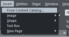
New on the Menu There is a new menu entry that really improves work
flow. It’s the Insert menu. You can insert an Image, Shape, Text area, or a
New Page. And you’ll notice another new entry at the top of the list,
Content Catalog. We’ll get back to the Insert menu in a moment. But let’s
look at the new Content Catalog (shown below and on the next page)
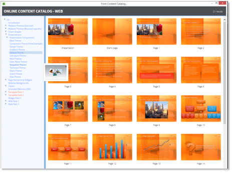
The new Content Catalog
shown on the left provides
fast on-demand online
access to Website Themes,
SmartShapes, Presentation
Themes, Page Elements and
Widgets, Clipart and more.
SCROLL
TO THE NEXT
PAGE
FIRST LOOK By Gary W. Priester
XARA
WEB DESIGNER 10
PREMIUM
FIRST LOOK
By Gary W. Priester
XARA
WEB
DESIGNER 10
PREMIUM
Free Web Hosting Package! Owners of Web
Designer 10 Premium get one FREE year of M
website hosting with Magix Online World. This
includes 2 GB of server space, a free domain
name, and a free web-based email package that
includes up to 5 mailboxes. Owners of both
versions also get Password Protection for their
web pages (via Magix). (Web Designer 9
Premium owners get coupons that let you
extend your free Magix Online World M web
hosting package for another year when you
upgrade).
New on the Menu
There is a new menu
entry that really
improves work flow.
It’s the Insert menu.
You can insert an Image, Shape, Text area, or a
New Page. And you’ll notice another new entry
at the top of the list, Content Catalog. We’ll get
back to the Insert menu in a moment. But let’s
look at the new Content Catalog (shown below
and on the next page)
The new Content Catalog shown on above
provides fast on-demand online access to Website
Themes, SmartShapes, Presentation themes, Page
Elements and Widgets, Clipart and a lot more.
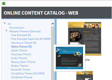
The Content Catalog is an extension of the Designs Gallery and is updated frequently. The Content Catalog is Cloud
based and offers content on demand. To access the catalog you must have an
Internet connection. (You
can also access the content
from the Designs Gallery if
you work off-line). The
catalog is resizable and is
easier for viewing and has
big thumbnails for all the
contents. When you have a
website or presentation
theme open, moving the
cursor over the listings on
the left side produces a
small pop-up thumbnail to
help quickly preview the different styles and colors. If you are using the trial
version, the templates displayed in blue on the the list are available for you to
try now. The items shown in red are available for free, but only after you purchase Web Designer 10 Premium.
There is also a large set of Business Specific Website Themes. These are available for an additional price. (My
photo of the balloons is displayed in the Web Pack 2 > Hover Widgets folder, one of several dozen photo
widgets).
Back to the New Insert Menu You can insert Images from a file, website, camera, or from the clipboard (for
screen captures, or images copied from another source). I discovered that Insert > Image > From Web Address
brings in the content of the whole page, text as well as all the photos and graphics and plops them down in
place on your page! You can insert Shapes such as rectangles, ellipses, SmartShapes, arrows, text panels,
speech bubbles. You can insert a Text Box (text area), and finally, you can insert a New Page including a blank page,
a duplicate page, or a template page from the Content Catalog. The Insert menu will soon become your one-stop
shop for adding content to your website.
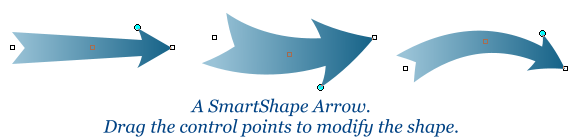
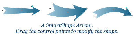
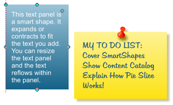
Speaking of SmartShapes SmartShapes are common vector shapes that have extra controls that let you modify
them in ways that would take a lot longer if you had to start from scratch. The arrow shown below is a good
example. On the next page we’ll see some more examples of SmartShapes. SmartShapes can be modified at any
time. Tomorrow or next year. Any time. That’s what I call smart.
Mouse over this image

This is a Speech
Bubble. You can
alter its size and
its text.

This is a
Speech
Bubble.
You can
alter its
size and
its text.
SCROLL
TO THE NEXT
PAGE
FIRST LOOK By Gary W. Priester
XARA
WEB DESIGNER 10
PREMIUM
FIRST LOOK
By Gary W. Priester
XARA
WEB
DESIGNER 10
PREMIUM
The Content Catalog is an extension of the Designs
Gallery and is updated frequently. The Content
Catalog is Cloud based and offers content on demand.
To access the catalog you must have an Internet
connection. (You can also access the content from the
Designs Gallery if you work off-line). The catalog is
resizable and is easier for viewing and has big
thumbnails for all the contents. When you have a
website or presentation theme open, moving the
cursor over the listings on the left side produces a
small pop-up thumbnail to help quickly preview the
different styles and colors. If you are using the trial
version, the templates displayed in blue on the the list
are available for you to try now. The items shown in
red are available for free, but only after you purchase
Web Designer 10 Premium. There is also a large set of
Business Specific Website Themes. These are available
for an additional price. (My photo of the balloons is
displayed in the Web Pack 2 > Hover Widgets folder,
one of several dozen photo widgets).
Back to the New Insert Menu You can insert Images
from a file, website, camera, or from the clipboard (for
screen captures, or images copied from another
source). I discovered that Insert > Image > From Web
Address brings in the content of the whole page, text
as well as all the photos and graphics and plops them
down in place on your page! You can insert Shapes
such as rectangles, ellipses, SmartShapes, arrows, text
panels, speech bubbles. You can insert a Text Box
(text area), and finally, you can insert a New Page
including a blank page, a duplicate page, or a template
page from the Content Catalog. The Insert menu will
soon become your one-stop shop for adding content
to your website.
Speaking of SmartShapes SmartShapes are common
vector shapes that have extra controls that let you
modify them in ways that would take a lot longer if
you had to start from scratch. The arrow shown below
is a good example. On the
next page we’ll see some
more examples of
SmartShapes. SmartShapes
can be modified at any time.
Tomorrow or next
year. Any time.
That’s what I call smart.

This is a Speech
Bubble. You can
alter its size and
its text.

This is a
Speech
Bubble.
You can
alter its
size and
its text.
Tap this image
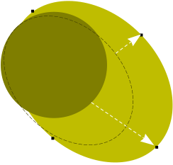
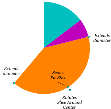
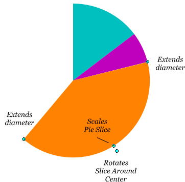
More SmartShapes The pie chart shown here was created using a Pie Segment SmartShape. Cloning
this shape allows you to quickly create a pie chart. The small cyan circles are the control points and let
you extend the diameter of the slice, scale the slice, and rotate the slice from the center of the pie circle.
Each slice can be edited at any time.
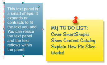
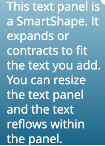
Text Panels Text Panels automatically adjust to to the amount of text in the box.
There are a whole bunch of these. You can resize the text,
the width of the line of text, and the size of the Text
Panel. And everything magically readjusts.
Below left is an elliptical SmartShape. OK
you ask, how smart can a simple ellipse
be? Well, I dragged the bottom control
point down and then the middle right point upward. If you’re bored and don’t have a
tight deadline, as I do with this review, you can spend hours playing with all these smart
shapes and you’ll marvel and how somethings so simple can also be so smart!
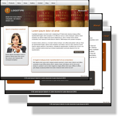
New Website Templates Web Designer 10 Premium owners now have 10 brand new
General Website Theme templates to choose from. These are professionally designed
full websites (not just single pages), that you can modify to fit your needs. By my
count, this makes a total of 70 professionally designed templates. In addition,
Premium owners get 132 Business Specific Website Themes from Accountancy to
Well Being and everything in between. And in many
cases, not one business specific theme but several
different designs to choose from. Six for Health and
Beauty, seven designs for Pub and Bar. Web Designer
10 Classic gets 5 new website themes for a total of 40. As
the saying goes, there is something for everybody! You can preview the Business
Specific Themes. They are attractive and attractively priced!
Improved PDF and Word DOC Import Filters The Microsoft Word DOCX
import filter has been enhanced and there is a new and improved PDF import
filter for getting content into your website.
SCROLL
TO THE NEXT
PAGE
FIRST LOOK By Gary W. Priester
XARA
WEB DESIGNER 10
PREMIUM
FIRST LOOK
By Gary W. Priester
XARA
WEB
DESIGNER 10
PREMIUM
More SmartShapes The pie chart shown here was
created using a Pie Segment SmartShape. Cloning
this shape allows you to quickly create a pie chart. The
small cyan circles are the control points and let you
extend the diameter of the slice, scale the slice, and
rotate the slice from the center of the pie circle. Each
slice can be edited at any time.
Text Panels Text Panels
automatically adjust to to the
amount of text in the box. There are
a whole
bunch of
these. You
can resize
the text, the
width of the
line of text,
and the size
of the Text
Panel. And everything magically readjusts.
Above is an elliptical SmartShape. OK you ask, how
smart can a simple ellipse be? Well, I dragged the
bottom control point down and then the middle right
point upward. If you’re bored and don’t have a tight
deadline, as I do with this review, you can spend hours
playing with all these smart shapes and you’ll marvel
and how somethings so simple can also be so smart!
New Website Templates Web Designer 10 Premium
owners now have 10 brand new General Website Theme
templates to choose from. These are professionally
designed full websites (not just
single pages), that you can
modify to fit your needs.
By my count, this makes
a total of 70
professionally designed
templates. In addition,
Premium owners get
132 Business Specific
Website Themes from
Accountancy to Well
Being and everything in
between. And in many cases, not one business specific
theme but several different designs to choose from.
Six for Health and Beauty, seven designs for Pub and
Bar. Web Designer 10 Classic gets 5 new website
themes for a total of 40. As the saying goes, there is
something for everybody! You can preview the
Business Specific Themes. They are attractive and
attractively priced!
Improved PDF and Word DOC Import Filters
The Microsoft Word DOCX import filter has been
enhanced and there is a new and improved PDF
import filter for getting content into your
website.
New Widgets There are several new photo widgets available for Web Designer 10 Premium owners. These join the
existing array of photo gallery, slide show, and zoom photo widgets!
There are new social media widgets including: Instagram badge, Instagram SnapWidgets (embed your Instagram
photos into a website as a photo gallery), Pinterest and LinkedIn badges. These join the Google, Facebook, Twitter,
Add This and more widgets in the Social Networking Widgets folder. And did I mention there’s a ton and a half of
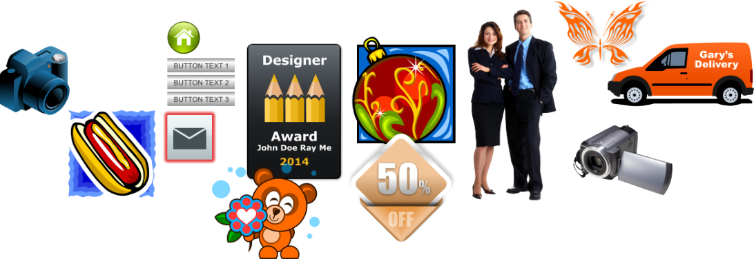
free clip art, photos and graphics in the Content Catalog (Samples below).
Placitas New Mexico
Z Accordion 3
One of five new photo
slide show widgets
TIP:
You can add a text title
over your slide show
SCROLL
TO THE NEXT
PAGE
FIRST LOOK By Gary W. Priester
XARA
WEB DESIGNER 10
PREMIUM
FIRST LOOK
By Gary W. Priester
XARA
WEB
DESIGNER 10
PREMIUM
New Widgets There are several new photo widgets
available for Web Designer 10 Premium owners. These
join the existing array of photo gallery, slide show, and
zoom photo widgets!
There are new social media widgets including:
Instagram badge, Instagram SnapWidgets (embed your
Instagram photos into a website as a photo gallery),
Pinterest and LinkedIn badges. These join the Google,
Facebook, Twitter, Add This and more widgets in the
Social Networking Widgets folder. And did I mention
there’s a ton and a half of free clip art, photos and
graphics in the Content Catalog (Samples below).
Placitas New Mexico
Let’s Sum Up! There is a lot to like in Web Designer 10. If you are not already using Xara Web Designer
or Xara Designer Pro, then what are you waiting for? Download your free 30-day trial version this very
instant! If you are currently using an earlier version of Web Designer, the Responsive Web Sites
capability alone should help you make up your mind to upgrade. Throw in true WYSIWYG, drag and
drop website design, compatibility with all browsers, support for CSS3 and HTML 5, and the best
features you need to create the greatest websites, and Web Designer 10 is the product for you. And
even if you can’t draw a straight line with a ruler, or you don’t have time to create a site from scratch,
with all the professionally designed websites (and don’t forget presentation templates), buttons,
headers, etc., you can create a professional site that looks like you hired a high priced design firm.
And let’s not forget the fabulous free MAGIX Online World hosting package for Web Designer 10
Premium and Classic. Plus with Premium you get the M package which includes 12 months of free
website hosting, 2 GB of storage space, a free domain name (such as MyFabulousWebsite.com), and an
e-mail account like BigMacher@MyFabulousWebsite.com, plus five additional e-mailboxes. Owners of
both versions also get free password protection for their sites.
The big question you need to ask yourself is can you get by with Xara Web Designer 10 Classic, or do
you want to go all out and get the top of the line, the crème de la crème, Xara Web Designer 10
Premium? I’m afraid I can’t answer that question for you but I can give you a handy link where you can
compare features and decide which version is the right one for you. Web Designer 10 Comparison
Chart. If you need help or just want to be part of the community, join us at the TalkGraphics Forums,
where the members are friendly, helpful, and knowledgeable. When you create your award winning
website or presentation, but sure to post it in the TalkGraphics Xara Web Gallery. Or just check in for a
little inspiration and see what other users have created.

SCROLL
TO THE NEXT
PAGE
FIRST LOOK By Gary W. Priester
XARA
WEB DESIGNER 10
PREMIUM
FIRST LOOK
By Gary W. Priester
XARA
WEB
DESIGNER 10
PREMIUM
Let’s Sum Up! There is a lot to like in Web
Designer 10. If you are not already using Xara
Web Designer or Xara Designer Pro, then what
are you waiting for? Download your free 30-day
trial version this very instant! If you are currently
using an earlier version of Web Designer, the
Responsive Web Sites capability alone should
help you make up your mind to upgrade. Throw
in true WYSIWYG, drag and drop website design,
compatibility with all browsers, support for CSS3
and HTML 5, and the best features you need to
create the greatest websites, and Web Designer
10 is the product for you. And even if you can’t
draw a straight line with a ruler, or you don’t
have time to create a site from scratch, with all
the professionally designed websites (and don’t
forget presentation templates), buttons,
headers, etc., you can create a professional site
that looks like you hired a high priced design
firm.
And let’s not forget the fabulous free MAGIX
Online World hosting package for Web Designer
10 Premium and Classic. Plus with Premium you
get the M package which includes 12 months of
free website hosting, 2 GB of storage space, a
free domain name (such as
MyFabulousWebsite.com), and an e-mail account
like BigMacher@MyFabulousWebsite.com, plus
five additional e-mailboxes. Owners of both
versions also get free password protection for
their sites.
The big question you need to ask yourself is can
you get by with Xara Web Designer 10 Classic, or
do you want to go all out and get the top of the
line, the crème de la crème, Xara Web Designer
10 Premium? I’m afraid I can’t answer that
question for you but I can give you a handy link
where you can compare features and decide
which version is the right one for you. Web
Designer 10 Comparison Chart. If you need help
or just want to be part of the community, join us
at the TalkGraphics Forums, where the members
are friendly, helpful, and knowledgeable. When
you create your award winning website or
presentation, but sure to post it in the
TalkGraphics Xara Web Gallery. Or just check in
for a little inspiration and see what other users
have created.